Outer Image Delivery Homepage Redesign
A UX/UI case study documenting the transformation of a fragmented, low-conversion homepage into a scalable, accessible platform.
A UX/UI case study documenting the transformation of a fragmented, low-conversion homepage into a scalable, accessible platform.
Redesigning Outer Image Delivery’s primary entry point for drivers, applicants, and customers.
Outer Image Delivery (OID) is a logistics and delivery company supporting over 300 drivers and administrative
users. The company’s public-facing website serves as the primary entry point for three key user groups:
delivery drivers, onboarding applicants, and customers seeking delivery services and support.
As the
Front-End
Engineer and UX/UI Design Engineer, I led the end-to-end redesign of OID’s homepage to improve usability,
accessibility, navigation clarity, and conversion pathways while aligning with evolving platform requirements.
This project focused on transforming a fragmented, low-conversion homepage into a streamlined, user-centered
entry point for drivers and customers. The redesign process involved comprehensive user research, competitive
analysis, and iterative design development, culminating in a scalable, accessible interface that supports
OID’s growth and enhances the user experience for all stakeholders.
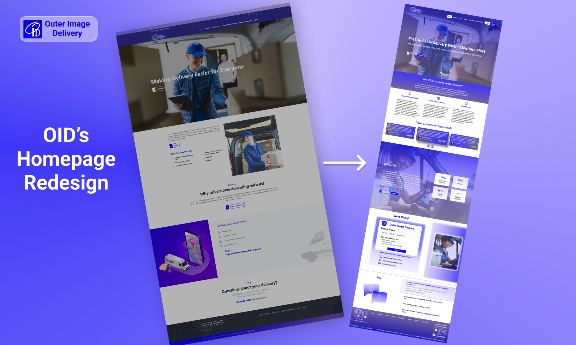
The legacy homepage presented multiple usability and structural issues that hindered user engagement and conversion. It lacked clear navigation paths for different user groups and failed to effectively communicate the platform's value proposition and hindered user onboarding and engagement.
As a result, users struggled to identify next steps, locate relevant information, and complete key actions such as applying as a driver or contacting support.
I conducted a full-page audit of the homepage and supporting pages, documenting usability issues related to:
Screenshots of the existing site were annotated to highlight pain points and usability breakdowns. Key findings discovered are listed below, categorized by UX/UI principles.
Based on the research findings, the design strategy for the homepage redesign focused on the following principles:
The redesign focused on reducing friction throughout the driver onboarding and customer support journeys while creating clearer pathways between key actions and platform goals.
I reorganized the homepage around the three primary user paths the client identified:
This structure ensured immediate routing for all major user groups.
Redundant navigation elements were removed, and content hierarchy was simplified.
Low-fidelity wireframes were created manually to establish:
Wireframes focused on layout and interaction before visual styling.
One of the key usability issues identified during the initial website audit was the lack of a clear value proposition in the homepage hero section. The existing headline, “making delivery easier for everyone,” was overly broad and did not effectively communicate the company’s core services or target audience. Because the homepage serves as the primary entry point for prospective customers, drivers, and partners, the hero messaging needed to quickly establish credibility while clearly explaining what the company offers. To address this, I redesigned the hero section to focus on a stronger, customer-oriented value proposition centered around reliability, professionalism, and business logistics. The revised messaging emphasizes dependable delivery services while clearly communicating the company’s role as a logistics partner for businesses and customers. In addition to updating the headline, a supporting subheadline was introduced to provide immediate context about the company’s delivery network and services. This two-layer messaging structure improves clarity, strengthens brand positioning, and helps new visitors quickly understand the company’s offerings. The redesigned hero also supports clearer user pathways through dual primary calls-to-action, allowing potential customers to learn more about services while enabling drivers to access onboarding and application features more efficiently. This update improves both the clarity and effectiveness of the homepage by aligning the messaging with the needs of prospective customers and the company’s long-term growth goals.
The original navigation system contained redundant links and multiple calls-to-action leading to the same destinations, which created confusion and reduced usability. I simplified the navigation by restructuring menu items and removing unnecessary duplication. Clear, distinct pathways were established for key actions such as exploring services, applying as a driver, and tracking packages. Additionally, dual primary CTAs were strategically placed within the navigation bar to improve visibility and accessibility. This redesign enhances clarity, reduces user friction, and supports more efficient navigation across the platform.
One of the most critical usability issues was the lack of clear user segmentation. Drivers, prospective applicants, and customers were all presented with the same content and navigation pathways, leading to confusion and inefficient user journeys. To resolve this, I restructured the homepage to clearly separate primary user paths, specifically for drivers and customers. Dedicated entry points and CTAs were introduced to guide users toward relevant actions such as applying to drive or accessing delivery services. This approach reduced cognitive load, improved navigation clarity, and ensured that each user group could quickly identify the information most relevant to their needs.
The original homepage included duplicated and overly dense service content that repeated information found on other pages. This redundancy contributed to poor content hierarchy and reduced overall usability. I redesigned the services section using a concise, card-based layout that highlights key offerings without overwhelming the user. Each service is presented with a clear label and supporting description, allowing users to quickly scan and understand available solutions. This streamlined approach improves readability, eliminates duplication, and encourages users to explore service-specific pages when needed.
Driver onboarding is a core business function, yet the original homepage did not effectively prioritize or highlight this user group. As a result, potential drivers lacked a clear and compelling pathway to apply. To address this, I introduced a dedicated driver-focused section that clearly communicates the benefits of joining the platform, such as flexibility, support, and earning opportunities. This section includes a prominent call-to-action to initiate the application process. By elevating driver recruitment within the homepage, the redesign aligns more closely with business goals and improves conversion potential for onboarding new drivers.
The original homepage lacked trust-building elements, such as testimonials or performance indicators, which are especially important in logistics and delivery services where reliability is critical. To strengthen credibility, I incorporated a testimonials and trust signals section highlighting user experiences and key performance metrics. This provides social proof and reassures potential customers of the company’s reliability and professionalism. Introducing these elements enhances user confidence and supports more informed decision-making.
Access to customer support was limited and not clearly visible in the original design, with key contact options either missing or difficult to locate. This created unnecessary friction for users seeking assistance. I redesigned the support section to centralize all contact options, including phone, email, and a dedicated contact page. Clear calls-to-action were added to ensure users can quickly reach support when needed. And a frewquently asked questions (FAQ) section was added to provide immediate answers to common inquiries. This improvement enhances usability, reduces frustration, and ensures users can easily access help throughout their journey.
The original footer lacked structure and visual consistency, making it difficult for users to locate important links and information. Additionally, it did not align well with the overall branding of the site. I redesigned the footer using a structured, multi-column layout that organizes navigation links, driver resources, and contact information into clearly defined sections. The visual design was also updated to align with the platform’s branding system. This results in improved usability, better information discoverability, and a more cohesive overall user experience.
From legacy experience to future-ready platform.
The redesign maintained OID's brand colors while implementing a more cohesive visual hierarchy, higher contrast, and improved typography.
The updated typography system features the Roboto font with improved hierarchal scaling and spacing for better legibility across different devices.
All components were documented for future reuse
Drag to reveal redesign • Click to expand
The redesigned platform was planned around a scalable, modular architecture
supporting multiple user groups, secure authentication workflows, and future
platform expansion.
The frontend is built with HTML, CSS, and JavaScript, utilizing a component-based
architecture for
scalability. The API layer
handles data fetching and business logic, while the authentication system ensures secure access for drivers
and customers. The database stores user information, service data, and application details. An integrated
CMS/Admin Panel allows for easy content updates and management by administrative staff.
HTML • CSS • JavaScript • Responsive UI Components
Data Processing • Validation • Service Integrations
User Access & Permissions
User Data • Applications • Services
Content Management • Operational Updates • Administration
Architecture details continue to evolve as platform functionality expands. Additional backend documentation and implementation diagrams will be added following deployment and stakeholder approval.
Production UI will be released post-launch
The final deployed UI will be released following the initial platform rollout and internal approvals.
While full analytics are pending implementation, the redesign is expected to:
Reserved space for analytics, A/B testing, and user metrics.
Driver Applications
Mobile Engagement
Support Requests
This project strengthened my ability to:
This project reinforced the importance of research-driven design, accessibility-first thinking, scalable system architecture, and iterative validation in building sustainable digital products.